sliceplots.one_dimensional module
Module containing useful 1D plotting abstractions on top of matplotlib.
-
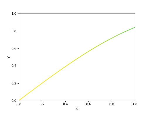
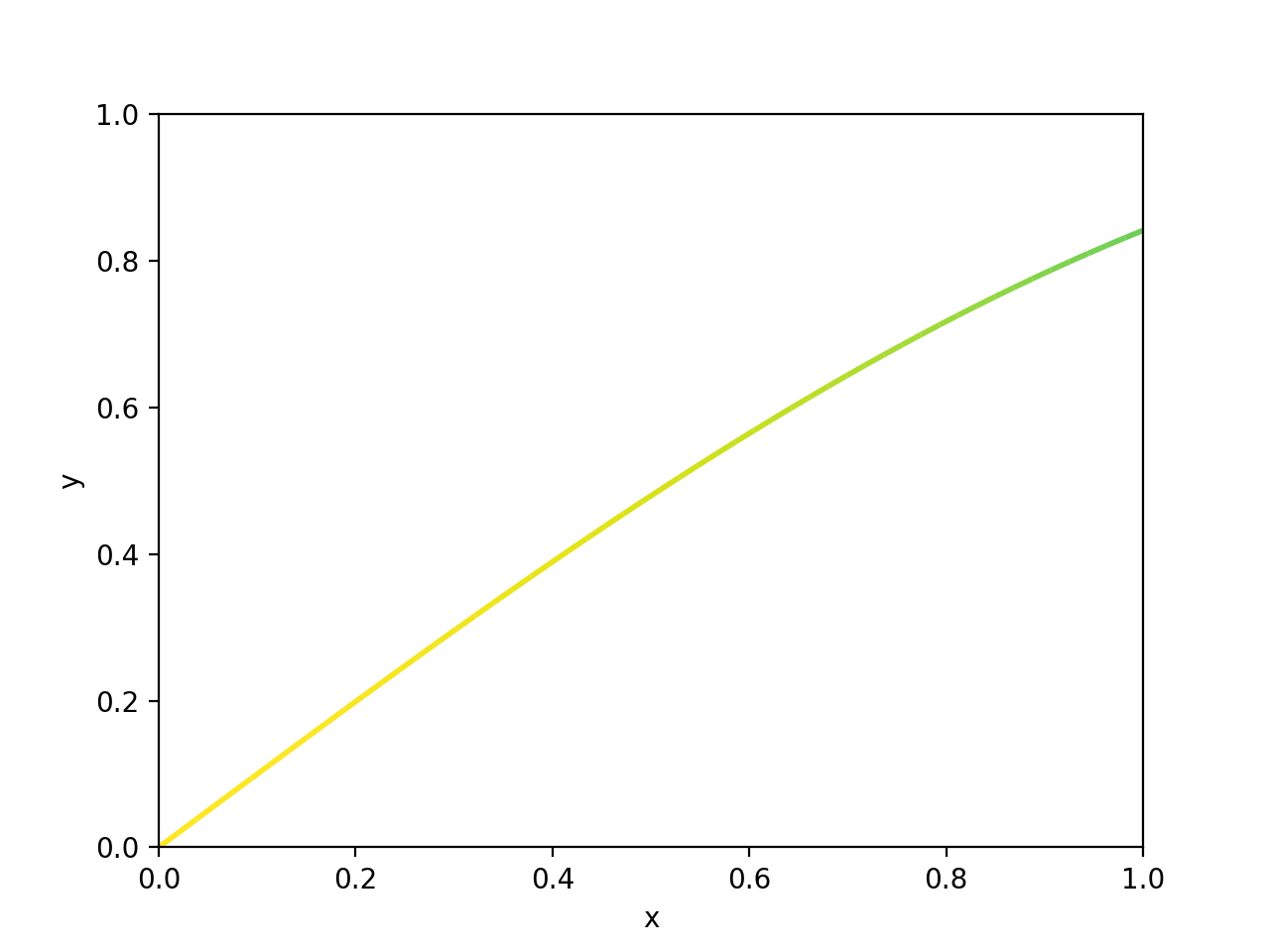
sliceplots.one_dimensional.plot_multicolored_line(*, ax=None, x, y, other_y, cmap='viridis', vmin=None, vmax=None, linewidth=2, alpha=1)[source]¶ Plots a line colored based on the values of another array.
Plots the curve
y(x), colored based on the values inother_y.- Parameters:
ax (
Axes, optional) – Axes instance, for plotting, defaults toNone. IfNone, a newFigurewill be created.y (1d array_like) – The dependent variable.
x (1d array_like) – The independent variable.
other_y (1d array_like) – The values whose magnitude will be converted to colors.
cmap (str, optional) – The used colormap (defaults to “viridis”).
vmin (float, optional) – Lower normalization limit
vmax (float, optional) – Upper normalization limit
linewidth (float, optional (default 2)) – Width of the plotted line
alpha (float, optional (default 1)) – Line transparency, between 0 and 1
- Returns:
ax, line – Main Axes and plotted line
- Return type:
Axes, LineCollection
- Raises:
AssertionError – If the length of y and other_y do not match.
References
matplotlibexample.Examples
We plot a curve and color it based on the value of its first derivative.
import numpy as np
from matplotlib import pyplot

from sliceplots import plot_multicolored_line

x = np.linspace(0, 3 * np.pi, 500)
y = np.sin(x)
dydx = np.gradient(y) * 100  # first derivative

_, ax = pyplot.subplots()

plot_multicolored_line(ax=ax, x=x, y=y, other_y=dydx)

ax.set(ylabel="y", xlabel="x")
(Source code, png, hires.png, pdf)

-
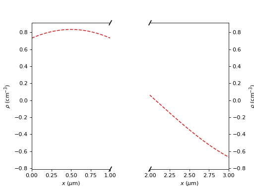
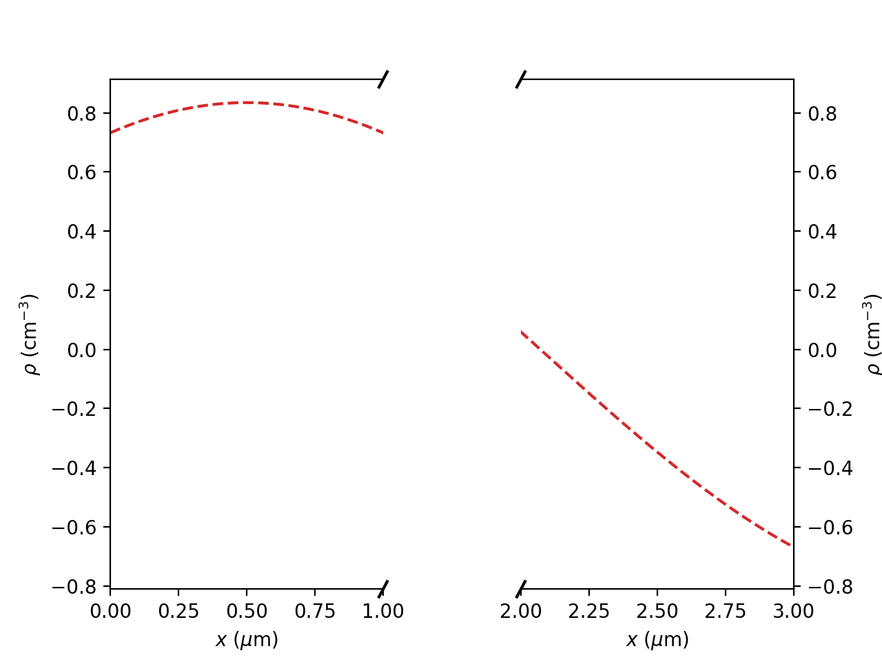
sliceplots.one_dimensional.plot1d_break_x(*, ax=None, h_axis, v_axis, param, slice_opts)[source]¶ Line plot with a broken x-axis.
- Parameters:
ax (
Axes, optional) – Axes instance, for plotting. IfNone, a newFigurewill be created. Defaults toNone.h_axis (1d array_like) – x-axis data.
v_axis (1d array_like) – y-axis data.
param (dict) – Axes limits and labels.
slice_opts (dict) – Options for plotted line.
- Returns:
ax_left, ax_right – Left and right Axes of the split plot.
- Return type:
tuple of Axes
Examples
import numpy as np
from matplotlib import pyplot

from sliceplots import plot1d_break_x

uu = np.linspace(0, np.pi, 128)
data = np.cos(uu - 0.5) * np.cos(uu.reshape(-1, 1) - 1.0)

_, ax = pyplot.subplots()

plot1d_break_x(
    ax=ax,
    h_axis=uu,
    v_axis=data[data.shape[0] // 2, :],
    param={
        "xlim_left": (0, 1),
        "xlim_right": (2, 3),
        "xlabel": r"$x$ ($\mu$m)",
        "ylabel": r"$\rho$ (cm${}^{-3}$)",
    },
    slice_opts={"ls": "--", "color": "#d62728"})
(Source code, png, hires.png, pdf)

-
sliceplots.one_dimensional.plot1d(*, ax=None, h_axis, v_axis, xlabel='', ylabel='', **kwargs)[source]¶ Plot the data with given labels and plot options.
- Parameters:
ax (class:~matplotlib.axes.Axes, optional) – Axes instance, for plotting. If
None, a newFigurewill be created. Defaults toNone.h_axis (
np.ndarray) – x-axis data.v_axis (
np.ndarray) – y-axis data.xlabel (str, optional) – x-axis label.
ylabel (str, optional) – y-axis label.
kwargs (dict, optional) – Other arguments for
plot().
- Returns:
ax – Modified Axes, containing plot.
- Return type:
Axes
Examples
>>> import numpy as np
>>> uu = np.linspace(0, np.pi, 128)
>>> data = np.cos(uu - 0.5) * np.cos(uu.reshape(-1, 1) - 1.0)
>>> plot1d(
...     h_axis=uu,
...     v_axis=data[data.shape[0] // 2, :],
...     xlabel=r"$z$ ($\mu$m)",
...     ylabel=r"$a_0$",
...     xlim=[0, 3],
...     ylim=[-1, 1],
...     color="#d62728",
... )
<Axes: xlabel='$z$ ($\\mu$m)', ylabel='$a_0$'>